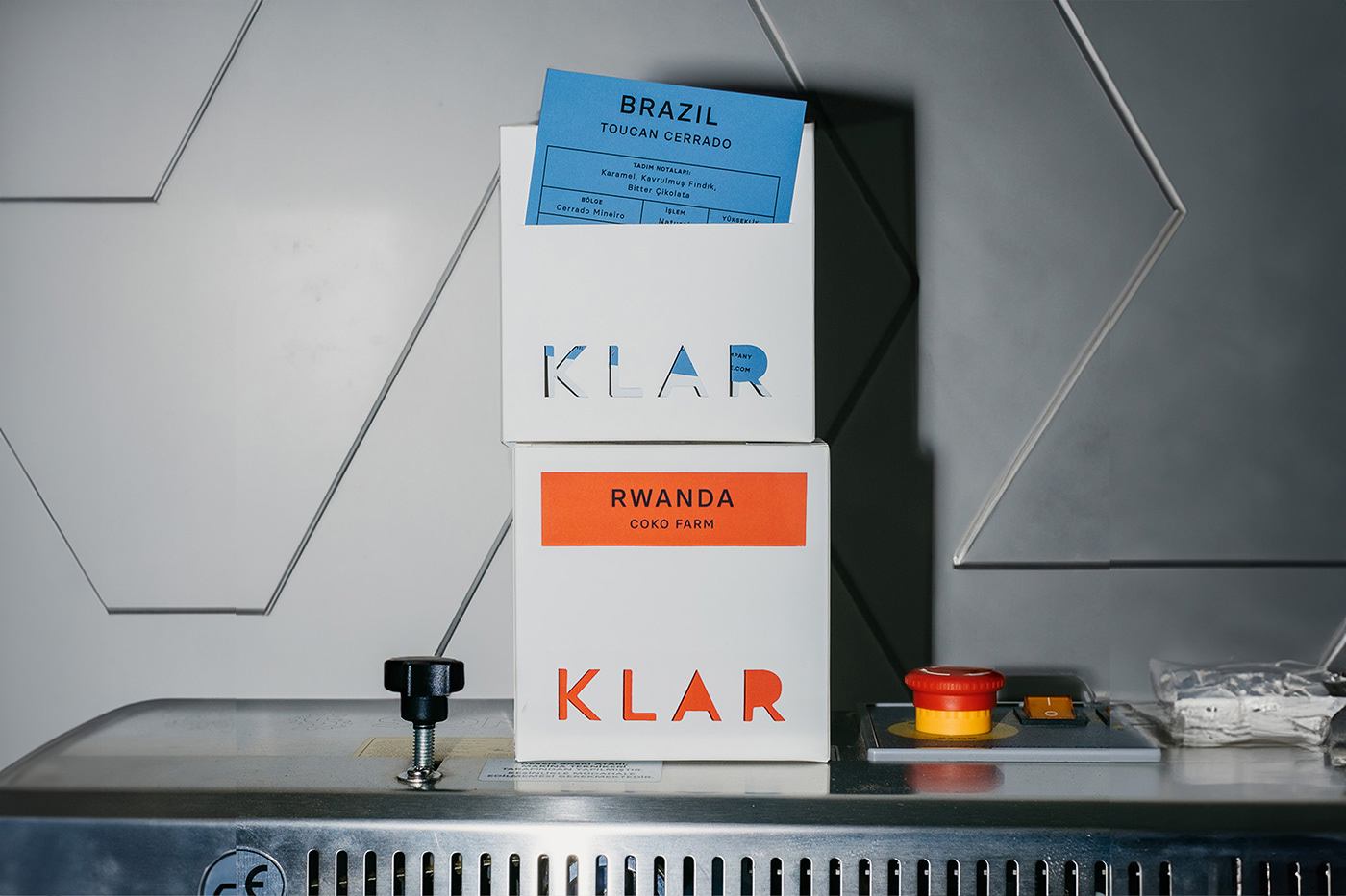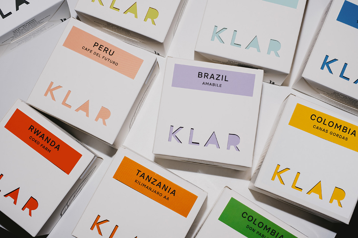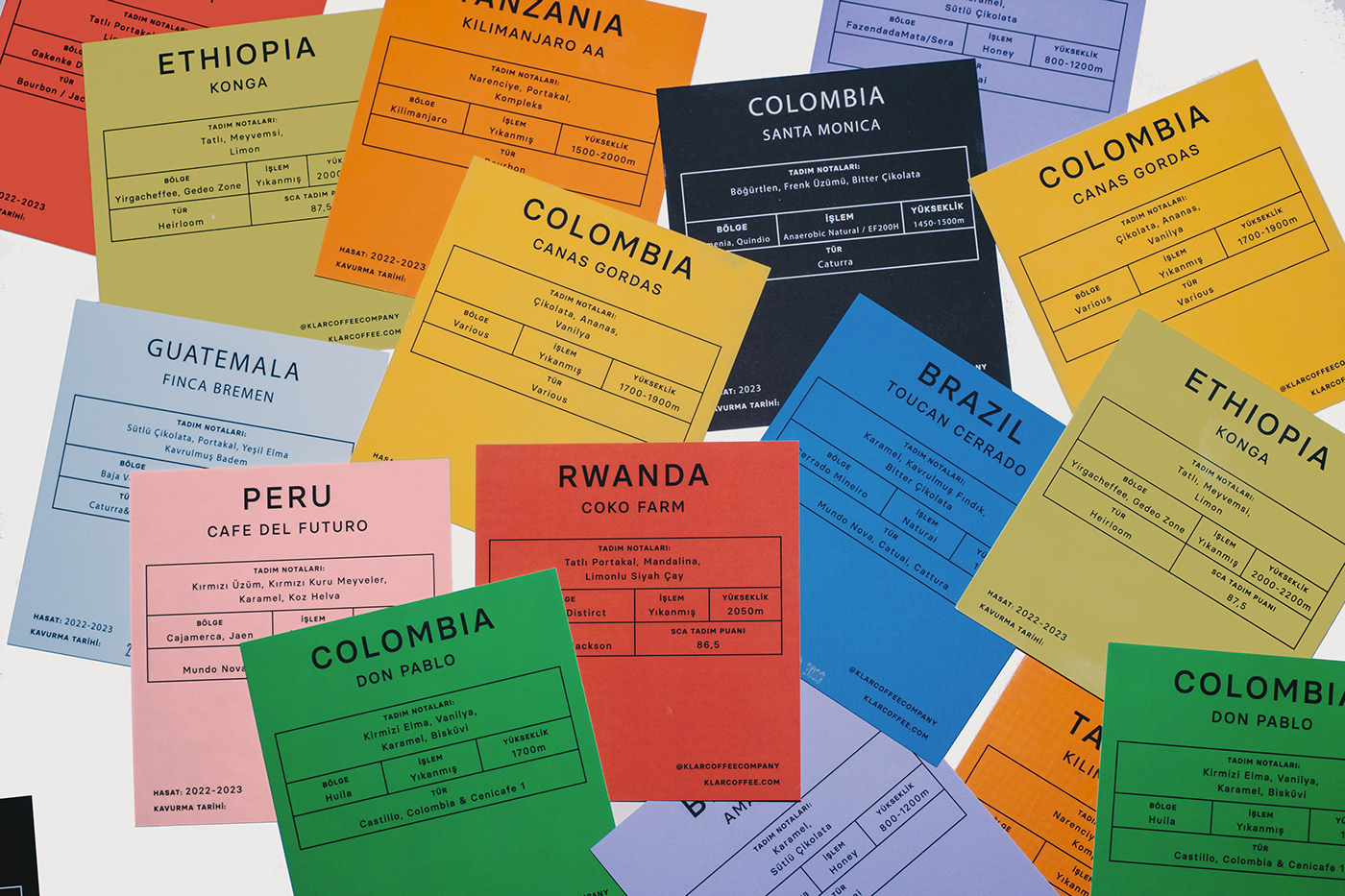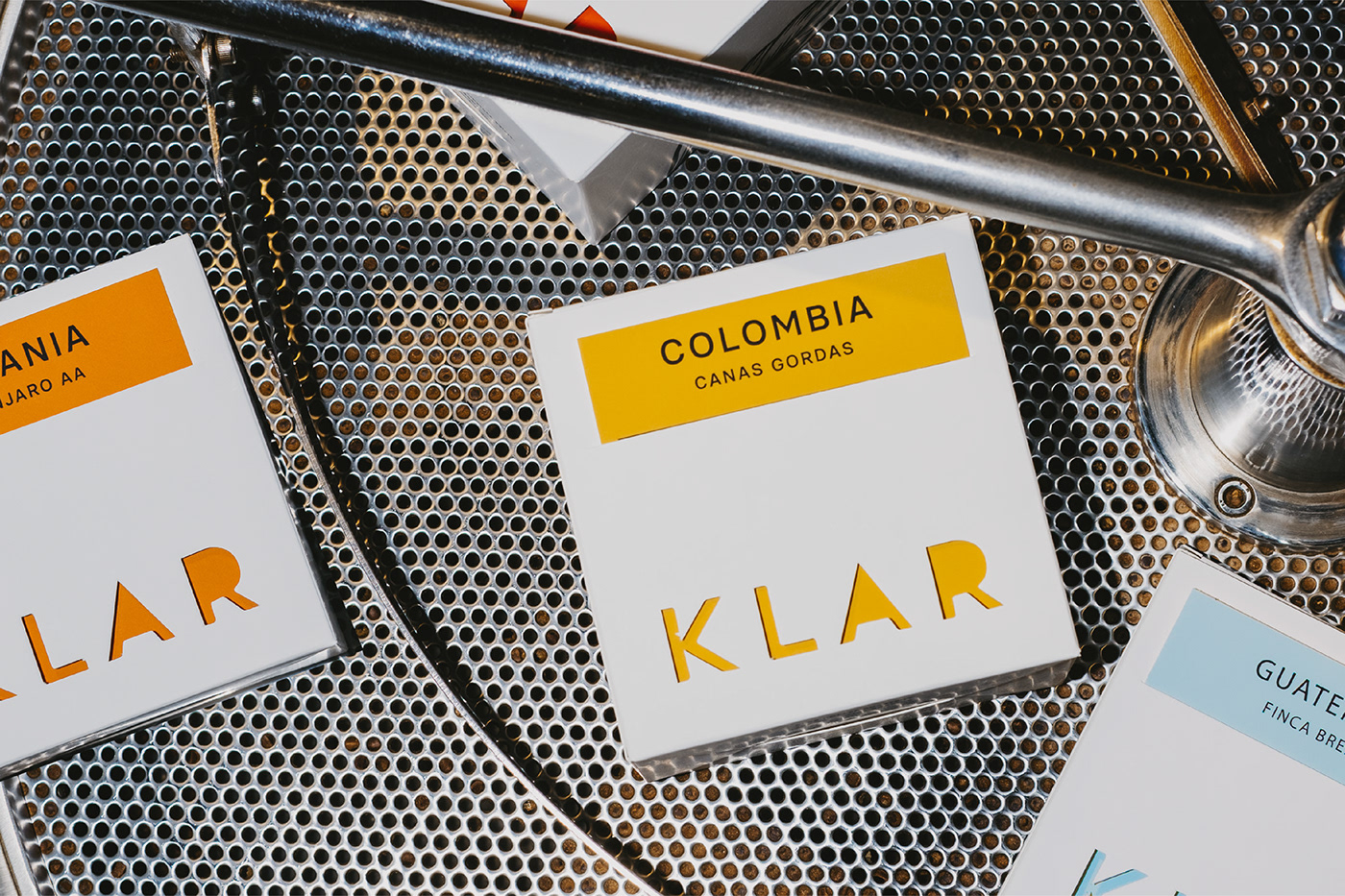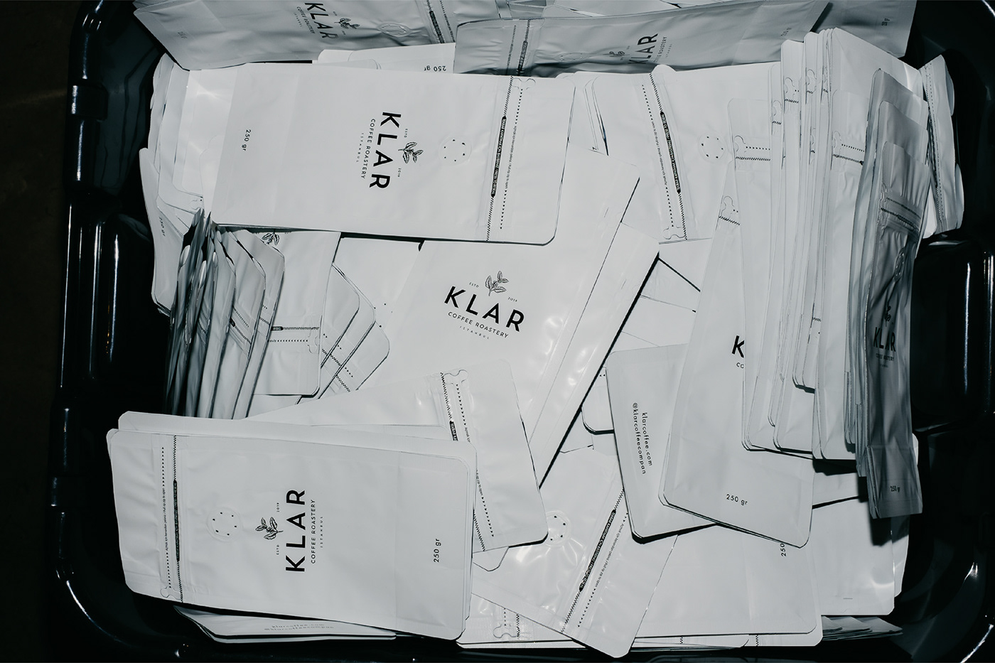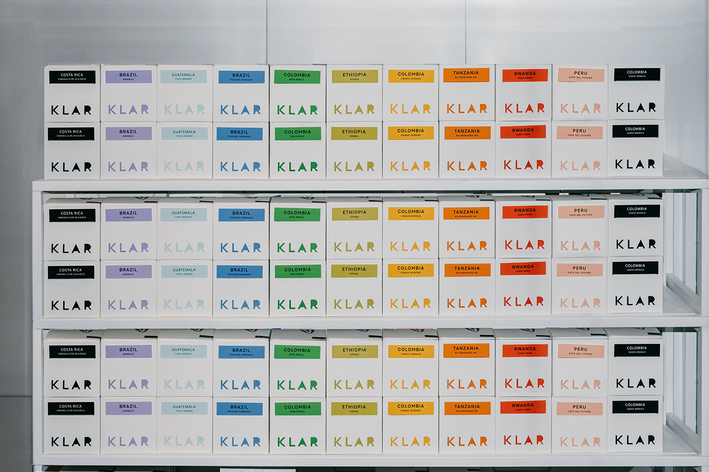
Packaging design for Klar Coffee features a minimalist wordmark with a twist – a cutout of the logo mark on a plain white box. This design choice not only adds a touch of sophistication but also allows for a fun and interactive element. Each box comes with vibrant and color-coordinated coffee information cards for every region. These cards not only provide essential details about the coffee's origin and tasting notes but also add a pop of personality to the cutout part of the box.
Choosing cards over stickers isn't just a matter of preference; it's a strategy for ensuring a consistent and error-free presentation. Placed in box pockets, each card aligns flawlessly at the same level, eliminating the risk of human error and elevating the overall design cohesiveness.
The choice of premium white matte paper with velvety touch, ensures a tactile and luxurious feel. This deliberate selection not only enhances the overall sensory experience but also conveys the exceptional quality of the coffee enclosed within.
Animation: Sedat Azazi
Featured on Packaging of the World and World Brand Design
Watch the design process here